Parcl Announces Its Latest Rebrand
I am so excited to have the opportunity to unveil Parcl's new brand identity today. We've worked countless hours over the last few months to prepare this. Our team has grown significantly and wanted to make sure our branding aligned more with the mission and values of the company.

Parcl Team
Aug 1, 2022

I am so excited to have the opportunity to unveil Parcl's new brand identity today. We've worked countless hours over the last few months to prepare this. Our team has grown significantly and wanted to make sure our branding aligned more with the mission and values of the company.
So let's get into it…
But first, a little background.
Currently, the real estate market faces a major problem, and Parcl was founded with a mission to solve it.
The average person has been locked out of real estate investing for too long. Historically the market has been dominated by major players with deep pockets. Ultimately making Real Estate investing inaccessible for most.
Parcl provides a simple way for individual investors to gain exposure to broad selections of the real estate market. Specifically, you can invest in neighborhoods you are familiar with and love.
And when you think about all the incredible things Parcl is doing:
Bringing liquidity to a traditionally illiquid market.
Harnessing the new powers of Blockchain technology.
Leveraging underutilized data of the Real Estate market.
Reducing economic inequality for investors around the world.
Digitizing one of the most outdated, antiquated markets in the world.
We didn't feel like our branding reflected this. So, we revaluated our identity and have given ourselves a new look.
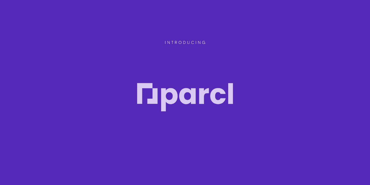
Let’s break down our new logo:
P for Parcl.
A digital square foot.
The foundation of real estate and digital real estate.
Blockchain – the technology in which we are able to exist.
Real Estate property lines – the bounding areas of real estate.
All together creates the perfect, recognizable icon.
Our Colors
Traditional institutions have used Blue to represent Security, Intuition, Loyalty, and Knowledge for years – recognizable on brands like Chase, PayPal, and Coinbase.
Our original Parcl Pink was the foundation of our brand and represented our ambition:
Strength, Creativity, Passion, and Connection.
Although we're rebranding, we feel it's important to always remember where you came from, which is why we've incorporated some aspects of our original identity.

So we married the two colors together – creating the new and iconic Parcl Periwinkle, which represents Royalty, Wisdom. Higher ideals and Power.

But we are not limited by one color – we use our colors to emphasize our versatility and can be used in a variety of different ways—all working together to create a unified brand presence.
Follow us
🌐 Join our Waitlist: https://parcl.co
🐤 Twitter: https://twitter.com/Parcl
🏡 Discord: https://discord.gg/zWxp2JupNA
Shared content and posted charts are intended to be used for informational and educational purposes only. Parcl does not offer, and this information shall not be understood or construed as, financial advice or investment recommendations. The information provided is not a substitute for advice from an investment professional. Parcl does not accept liability for any financial loss or damages. For more information please see the terms of use.
Parcl Team


